Matplotlib Graphs in Research Papers
When you write a scientific paper, one of the most common tasks is to analyze the obtained results and design beautiful graphs explaining them. Currently, in the research community, Python’s ecosystem is the most popular for achieving these goals. It provides web-based interactive computational environments (e.g., Jupyter Notebook/Lab) to write code and describe the results, and pandas and matplotlib libraries to analyze data and produce graphs correspondingly. Unfortunately, due to the rich functionality, it is hard to start using them effectively in your everyday research activities when you initiate your path as a researcher. In this article, I would like to share some tips and tricks on how to employ the matplotlib library to produce nice graphs for research papers.
Table of Contents
Prerequisites
As I mentioned in my articles, as a desktop operating system, I use Kubuntu; hence, all the examples from this article are tested on this OS. Currently, I use Python version 3.9, and for package management, I use poetry. In the configuration file of the accompanying repository, you can find all the details about the versions of the libraries used in this tutorial.
If you want to run the accompanying notebook, install poetry, change the working directory to notebook/, and run the following command:
$ poetry install
This command will create a Python virtual environment, download the necessary dependencies and install them. After that, you can simply run VSCode within this directory, selecting the newly created virtual environment as the kernel for this notebook.
I use a timeseries data provided by plotly as a dataset to show all the visualizations in this article. I have already downloaded the file and added into the repository. However, you can download the file yourself, and load/preprocess it using the following code with the help of the pandas library:
import os
import pandas as pd
ts_df = pd.read_csv(IN_PATHS['timeseries_file'])
ts_df['Date'] = pd.to_datetime(ts_df.Date)
Paths Check
When you start developing your data analysis notebooks, the first important thing is to define the variables that will correspond to the paths where the data for analysis is located and where to store the results of the analysis. Then, in the rest of the notebook, you can use these variables instead of typing a full path each time. Thus, if you need to change a path later (e.g., if you want to analyze another dataset with the same notebook), you would need to do this in only one place.
Usually, I use two dictionaries to define paths: the IN_PATHS dictionary stores the paths of the source data, while the OUT_PATHS dictionary keeps the paths where the results of the analysis. Keys in these dictionaries describe the corresponding locations, e.g., timeseries_file identified the path to the file with the time series data.
Now, I use VSCode for the data analysis activities (see this article for details on how I use it). Its intellisense subsystem supports dictionaries, and if you type the name of a dictionary variable and open the brackets, it suggests possible key names (see Figure 1 exemplifying this feature).
I append the _dir suffix to the keys that define paths to directories. Such a naming convention allows me to enforce additional logic on the paths corresponding to the keys with that suffix. For input paths, I can verify that the paths corresponding to the keys with the _dir suffix exist and point to directories. For output paths, if the output directory corresponding to the key with the _dir suffix does not exist, I can create all intermediate directories to it. Following the DRY principle, I have developed the check_paths(in_paths, out_paths) function that does this by getting two dictionaries, named in_paths and out_paths as the parameters, and performing the logic described above:
def check_paths(in_paths, out_paths):
    import os, shutil, itertools

    for pth_key in in_paths:
        pth = in_paths[pth_key]
        if not os.path.exists(pth):
            print(f'Path [{pth}] does not exist')
        if pth_key.endswith('_dir') and (not os.path.isdir(pth)):
            print(f'Path [{pth}] does not correspond to a directory!')

    for pth_key in out_paths:
        pth = out_paths[pth_key]
        if pth_key.endswith('_dir'):
            abs_path = os.path.abspath(pth)
        else:
            abs_path = os.path.abspath(os.path.dirname(pth))
        if not os.path.exists(abs_path):
            print(f'Creating path: [{abs_path}]')
            os.makedirs(abs_path)
I call this function at the beginning of a data analysis notebook providing IN_PATHS and OUT_PATHS dictionaries as the values of the arguments: check_paths(IN_PATHS, OUT_PATHS)`.
Illustrative Example
To plot the time series from the loaded dataset, we can use the following code. At first, we need to import the required modules from the matplotlib library:
import matplotlib
import matplotlib.pyplot as plt
from matplotlib.pyplot import subplots
And then plot the data:
fig, ax = plt.subplots()
for indx, column_name in enumerate(['A', 'B', 'C', 'D', 'E', 'F', 'G']):
    ax.plot(ts_df['Date'], ts_df[column_name], label=column_name)
ax.tick_params(axis='x', labelrotation = 90)
ax.set(xlabel='Date', ylabel='Value')
ax.legend(loc='center right', ncol=4)
fig.show()
This code creates a figure space and axes, and plots a separate line for each column in the dataframe. Then it rotates the x-axis labels by 90 degrees to make tick values not overlap. The fig.show() method shows the figure.
However, more often, we use the fig.savefig() method to store the resulting figure. The first parameter of this call is the path to the file, where the figure should be stored. Note that the containing directory must exist. Otherwise, you will get an error. Based on the extension of the file, matplotlib will try to determine the format of the figure. For scientific papers, pdf is de-facto the standard: matplotlib stores vector figures if the pdf format is used, and pdflatex, which we typically use to compile our LaTeX paper, can embed figures of this type. Throughout the article, I mostly use the following code to store figures (see Section “Saving Figures” for an improved approach):
fig.savefig(
    os.path.join(OUT_PATHS['figs_dir'], '2.pdf'),
    bbox_inches='tight',
)
To exemplify how the results of our experiments look in a LaTeX paper, I have created an accompanying fake (Lorem Ipsum) paper using a double-column template typical for many computer science conferences. You can find the sources of the paper in the paper directory. The figures are added to the paper using the figure environment:
\begin{figure}[!h]
    \centering
    \includegraphics[width=\columnwidth]{1}
    \caption{Illustrative Example}
    \label{fig:illustrative_example}
\end{figure}
Improvements
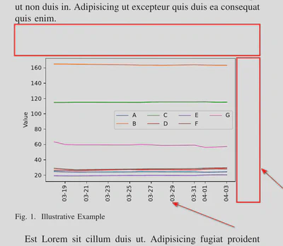
Unfortunately, suppose you use only the default values for the fig.savefig() arguments, the result is far from the one you would use in a scientific paper (e.g., see Figure 2 or Figure 1 in the accompanying paper): the margins around the graph are wide, the dates and x-axis title are cut. Let’s consider how we can improve the figure and prepare it to be used in scientific papers.
Tightening Bounding Box
The bbox_inches argument of the fig.savefig() method can be used to remove wide margins. It is used to specify a bounding box – a rectangular area that defines a visible part of a graph. You can use it to set the exact coordinates of the upper left and lower right corners of your graph, or you can just set this parameter to tight. In this case, matplotlib will automatically calculate the coordinates of the bounding box, taking into account our preference for small margins around the graph elements. Figure 3 (or Figure 2 of the accompanying paper) shows how this parameter value improves the graph presentation. As you can see, after applying this parameter value, the margins are small, the figure occupies the whole width of the column, and the figure’s cut parts (dates and x-axis title) are also visible.
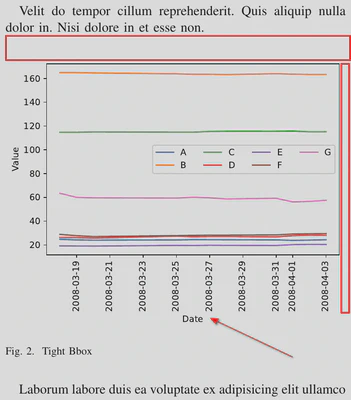
Figure Style
The matplotlib library brings facilities to change the look and feel of every graph component. For instance, it provides options to change the background; to add and adapt grids; to adjust titles, ticks, and texts location and presentation; to define fonts for different graph elements, etc. However, given a huge number of these parameters, configuring all of them is almost a mission-impossible task. Therefore, matplotlib has a number of embedded styles that change parameter values en masse. The list of available styles can be found in the plt.style.available property. The following code can be used to visualize available styles (see Figure 4 for a result):
import math

available_styles = plt.style.available
n_styles = len(available_styles)

fig = plt.figure(dpi=100, figsize=(12.8, 4*n_styles/2), tight_layout=True)
for i, style in enumerate(available_styles):
    with plt.style.context(style):
        ax = fig.add_subplot(math.ceil(n_styles/2.0), 2, i+1)
        for indx, column_name in enumerate(['A', 'B', 'C', 'D', 'E', 'F', 'G']):
            ax.plot(ts_df['Date'], ts_df[column_name], label=column_name)
        ax.tick_params(axis='x', labelrotation = 90)
        ax.set(xlabel='Date', ylabel='Value')
        ax.legend(loc='center right', ncol=4)
        ax.set_title(style)

fig.show()

As you can see, at the beginning of this code excerpt, we assign to the available_styles variable the list of available styles defined in the matplotlib.style.matplotlib.style.available property. Then, we iterate over this list and apply a style locally with the help of the matplotlib.style.context custom context manager. In addition to this, we can apply a particular style using the matplotlib.pyplot.style.use(style) method. Usually, you use this method at the beginning of your notebook to apply the same style to all figures in it.
There are several styles from the list that I prefer to use in my papers. Here they are:
seaborn-paperseaborn-talkseaborn-notebookseaborn-colorblindtableau-colorblind10
In the accompanying paper, you can see the graphs produced using these styles. Until recently, I have used the seaborn-paper (see Figure 5) and seaborn-talk (see Figure 6) styles for my papers and talks correspondingly. As you can see, these figures are identical because I used a vector format to save and show them within this article. However, there is a difference: the latter style, seaborn-talk produces figures of larger sizes. Therefore, they look better if you store them using a rasterized format.


However, lately, I have employed the seaborn-colorblind style, which uses colors distinguishable by colorblind people (see Figure 7). As you can see, the colors of the lines have changed.

Unfortunately, matplotlib does not provide a style with the same color map to produce graphs for talks. Luckly, when I was writing this article, I have found out that it is possible to combine several styles if the latter does not modify the default colors. Thus, I can produce a seaborn-talk-kind graph with a palette from the seaborn-colorblind style using the following code (see Figure 10 in the accompanying paper, the result look the same as in Figure 7):
with plt.style.context(['seaborn-colorblind', 'seaborn-talk']):
    fig, ax = plt.subplots()
    for indx, column_name in enumerate(['A', 'B', 'C', 'D', 'E', 'F', 'G']):
        ax.plot(ts_df['Date'], ts_df[column_name], label=column_name)
    ax.set_title('Colors Combined')
    ax.tick_params(axis='x', labelrotation = 90)
    ax.set(xlabel='Date', ylabel='Value')
    ax.legend(loc='center right', ncol=4)

    fig.savefig(
        os.path.join(OUT_PATHS['figs_dir'], '9.pdf'),
        bbox_inches='tight',
    )
In addition to these predefined styles, matplotlib also provides a possibility to plot a graph using the xkcd sketching style (please see the official documentation for an additional example). You can apply this style using the following code (see Figure 8):
with plt.xkcd():
    fig, ax = plt.subplots()
    for indx, column_name in enumerate(['A', 'B', 'C', 'D', 'E', 'F', 'G']):
        ax.plot(ts_df['Date'], ts_df[column_name], label=column_name)
    ax.set_title('xkcd')
    ax.tick_params(axis='x', labelrotation = 90)
    ax.set(xlabel='Date', ylabel='Value')
    ax.legend(loc='center right', ncol=4)
    fig.savefig(
        os.path.join(OUT_PATHS['figs_dir'], '9.pdf'),
        bbox_inches='tight',
    )

If you want to apply this style to all graphs in a notebook, instead of using the matplotlib.pyplot.style.use(style) method, call matplotlib.pyplot.xkcd() at the beginning of the notebook.
Increasing the Distinguishability of Lines
Unfortunately, the default palettes have a low number of pre-defined colors. For instance, the seaborn-colorblind style defines only six colors. Therefore, if you have more than six different variables to plot on the same graph, you will get some of them using the same color. For instance, you can see in Figure 7 that Lines A and G have the same color. At the same time, in research, it is typical when you have to combine an even higher number of experiment results on the same plot. Of course, you can use styles that have a larger number of default colors in their palette. However, the better approach is to use other visual facets. Fortunately, matplotlib provides some facilities to do this: you can employ different markers or different line styles. The former approach is useful when you have several sparse points, and the line joins them. The latter approach is convenient when the number of dots is very high, or they are close to each other. Anyway, the handier method for both approaches is to define a custom cycler that iterates either over different markers or line styles. Additionally, the colors of lines and markers could be another mechanism to distinguish lines.
A custom Cycler object, used to change line styles in graphs, is defined with a helper factory method called cycler defined in the cycler module. For instance, the following code imports this function and defines a custom cycler with different markers:
from cycler import cycler
custom_marker_cycler = (cycler(marker=['o', 'x', 's', 'P']))
Once a custom cycler is defined, you can start employing it in your graphs using the matplotlib.axes.Axes.set_prop_cycle(...) method of the Axes object (Figure 9):
fig, ax = plt.subplots()

ax.set_prop_cycle(custom_marker_cycler) # setting the cycler for the current figure

for indx, column_name in enumerate(['A', 'B', 'C', 'D', 'E', 'F', 'G']):
    ax.plot(ts_df['Date'], ts_df[column_name], label=column_name)
ax.tick_params(axis='x', labelrotation = 90)
ax.set(xlabel='Date', ylabel='Value')
ax.legend(loc='center right', ncol=4)

fig.savefig(
    os.path.join(OUT_PATHS['figs_dir'], '10.pdf'),
    bbox_inches='tight',
)

Similarly, it is possible to define a cycler that rotates different line styles (see Figure 10):
custom_ls_cycler = (cycler(ls=['-', '--', ':', '-.']))

fig, ax = plt.subplots()

ax.set_prop_cycle(custom_ls_cycler) # setting the cycler for the current figure

for indx, column_name in enumerate(['A', 'B', 'C', 'D', 'E', 'F', 'G']):axum
    ax.plot(ts_df['Date'], ts_df[column_name], label=column_name)
ax.tick_params(axis='x', labelrotation = 90)
ax.set(xlabel='Date', ylabel='Value')
ax.legend(loc='center right', ncol=4)

fig.savefig(
    os.path.join(OUT_PATHS['figs_dir'], '11.pdf'),
    bbox_inches='tight',
)

Instead of drawing plots each time, you can check what styles the cycler defines with the following code:
for c in custom_marker_cycler:
    print(c)
If you run this code, you should get the following output:
{'marker': 'o'}
{'marker': 'x'}
{'marker': 's'}
{'marker': 'P'}
Each line of the output describes a separate style. Thus, our custom_marker_cycler rotates over four different marker styles, i.e., the first line will have o markers, the second – x markers, the fourth – P markers, and the fifth will start with o markers again.
Note the brackets around the call of the cycler function. I put them because it is possible to combine several cyclers together using the + and * operators overriden for the Cycler class. The + operator combines the styles of two Cyclers into one. For instance, consider the following code:
# adding cyclers
# lengths of the cyclers should be equal, here equal to 4
print('Adding cyclers')
custom_cycler = (
    cycler(marker=['o', 'x', 's', 'P']) +
    cycler(ls=['-', '--', ':', '-.'])
)

for c in custom_cycler:
    print(c)
It creates two Cycler objects, each of which is responsible for particular aspects of line visualization, namely markers and line styles in this example. Note that the sizes of the objects should be the same (four in this example). The resulting new Cycler object will combine two styles (see Figure 11):
Adding cyclers
{'ls': '-', 'color': 'r'}
{'ls': '--', 'color': 'g'}
{'ls': ':', 'color': 'b'}
{'ls': '-.', 'color': 'd'}

It is also possible to multiply (* operator) cyclers. In this case, the resulting cycler is a cartesian product of the styles of the constituting cyclers. Note that the sizes of the constituting cyclers are not required to be equal in this case:
# multiplying cyclers
# lenghts of the cyclers can be different
print('Multiplying cyclers')
custom_cycler = (
    cycler(marker=['o', 'x', 's', 'P']) *
    cycler(ls=['-', '--', ':'])
)

for c in custom_cycler:
    print(c)
The resulting cycler will have 12 different styles (see Figure 12):
Multiplying cyclers
{'marker': 'o', 'ls': '-'}
{'marker': 'o', 'ls': '--'}
{'marker': 'o', 'ls': ':'}
{'marker': 'x', 'ls': '-'}
{'marker': 'x', 'ls': '--'}
{'marker': 'x', 'ls': ':'}
{'marker': 's', 'ls': '-'}
{'marker': 's', 'ls': '--'}
{'marker': 's', 'ls': ':'}
{'marker': 'P', 'ls': '-'}
{'marker': 'P', 'ls': '--'}
{'marker': 'P', 'ls': ':'}

It is also possible to define a cycler iterating over colors (see Figure 13):
custom_color_cycler = (cycler(color='rgbk'))

for c in custom_color_cycler:
    print(c)
{'color': 'r'}
{'color': 'g'}
{'color': 'b'}
{'color': 'k'}

Although you can use your own color palette, it is often more convenient to use colors defined in the current style. For instance, the seaborn-colorblind style defines a palette of colors distinguishable by colorblind people. We can get the list of these colors through the matplotlib.pyplot.rcParams['axes.prop_cycle'].by_key()['color'] call and define a custom cycler over these colors (the resulting figure will look like Figure 5).
Although scientists currently lean towards using colorful graphs, this is not always the case – some conferences still require the use of only black and white colors. It is possible to define a cycler for this case as well, altering only line and marker styles (see Figure 14):
black_n_white_cycler = (
    cycler(color=['black']) *
    cycler(ls=['-', '--', ':', '-.']) *
    cycler(marker=['o', 'x', 's', 'P'])
)

Figure Size
For a long time, the purpose of the figsize parameter was unclear to me. If you open the documentation of the matplotlib.pyplot.figure method, you can read the following description of this argument:
figsize(float, float), default: rcParams[“figure.figsize”] (default: [6.4, 4.8]) Width, height in inches.
However, in research, we usually produce figures in a vector format (pdf); therefore, you should not notice any visual issues in manuscripts. The difference became clear to me only after I produced several figures with different figsize values and put them into the same paper. In this section, I repeat the steps of my experiment to exemplify my findings.
Width
The figsize argument defines width and height together. However, for clarity, let’s consider them separately, starting with the width component. Let’s create three figures with different sizes preserving the same default ratio (4:3) between width and height (Figures 17, 18, and 19 in the accompanying paper):


As you can see from these examples, the figsize parameter works like a scale changer: the larger the width (and the height), the smaller the figure elements. Thus, you can use this parameter (however, better in a small range) to enhance your figures. For instance, sometimes, a legend box may overlap with some graph elements. You can change the figsize values to get this issue fixed (bigger figsize values will produce more “spare space” for the legend box). However, I would not recommend employing this approach often because otherwise, in your manuscript, the figures will look different.
You can still ask what width value you should use. Frankly, there is no universal answer to this question. You can experiment with different figsize values on your own (like we did in this section: creating several figures and checking how they look in a manuscript) and choose the one that you like the most. I prefer to set the width to either 6.4 or 6 inches. Here, I follow the following logic. Most conferences where I submit my papers require manuscripts in the A4 letter double-column format. The width of the A4 letter page is 8.3 inches; therefore, the size of one column is around 4 inches. However, as you can see, Figure 17, for which we defined the width of 4 inches, does not look nice. The reason is that, by default, matplotlib uses larger font sizes than the ones in scientific papers. Of course, you can adjust the font sizes and the widths of all elements, but the better approach is to make the figsize value bigger.
Height
The default value for the figsize value is [6.4, 4.8], which gives us the 4:3 ratio between width and height. However, I think figures produced with this ratio do not look nice. One reason is that nowadays, you face 16:10 and 16:9 ratios more often. Indeed, new monitors and presentations’ page setups usually employ these ratio values rather than 4:3. Therefore, I also prefer to use them to produce my figures. Moreover, adding figures with this ratio into presentations is much easier.
Thus, you can calculate the height value depending on the width and what ratio you have chosen. My preferences are the following:
- Ratio: 16:10 ->
figsize: [6, 3.75] - Ratio: 16:9 ->
figsize: [6, 3.375] - Ratio: 16:10 ->
figsize: [6.4, 4] <- my default - Ratio: 16:9 ->
figsize: [6.4, 3.6]
Figure 18 (or Figure 20 in the accompanying paper) shows the final result.

Saving Figures
So far, we have been using the matplotlib.figure.Figure.savefig method to store figures, for instance:
fig.savefig(
    os.path.join(OUT_PATHS['figs_dir'], '20.pdf'),
    bbox_inches='tight',
)
However, using this method is not very convenient. For instance, for manuscripts, we produce figures in pdf format, while for presentations, png format is preferable. Thus, if you make figures for a presentation, you must change file extensions everywhere. In addition, when you produce figures in png format, you may also need to set up values of some other arguments, e.g., pixel density or transparency. Doing this each time is not sustainable (DRY!); therefore, I have developed the save_fig function that facilitates the process of saving figures:
def save_fig(
        fig: matplotlib.figure.Figure,
        fig_name: str,
        fig_dir: str,
        fig_fmt: str,
        fig_size: Tuple[float, float] = [6.4, 4],
        save: bool = True,
        dpi: int = 300,
        transparent_png = True,
    ):
    """This procedure stores the generated matplotlib figure to the specified
    directory with the specified name and format.

    Parameters
    ----------
    fig : [type]
        Matplotlib figure instance
    fig_name : str
        File name where the figure is saved
    fig_dir : str
        Path to the directory where the figure is saved
    fig_fmt : str
        Format of the figure, the format should be supported by matplotlib
        (additional logic only for pdf and png formats)
    fig_size : Tuple[float, float]
        Size of the figure in inches, by default [6.4, 4]
    save : bool, optional
        If the figure should be saved, by default True. Set it to False if you
        do not want to override already produced figures.
    dpi : int, optional
        Dots per inch - the density for rasterized format (png), by default 300
    transparent_png : bool, optional
        If the background should be transparent for png, by default True
    """
    if not save:
        return

    fig.set_size_inches(fig_size, forward=False)
    fig_fmt = fig_fmt.lower()
    fig_dir = os.path.join(fig_dir, fig_fmt)
    if not os.path.exists(fig_dir):
        os.makedirs(fig_dir)
    pth = os.path.join(
        fig_dir,
        '{}.{}'.format(fig_name, fig_fmt.lower())
    )
    if fig_fmt == 'pdf':
        metadata={
            'Creator' : '',
            'Producer': '',
            'CreationDate': None
        }
        fig.savefig(pth, bbox_inches='tight', metadata=metadata)
    elif fig_fmt == 'png':
        alpha = 0 if transparent_png else 1
        axes = fig.get_axes()
        fig.patch.set_alpha(alpha)
        for ax in axes:
            ax.patch.set_alpha(alpha)
        fig.savefig(
            pth,
            bbox_inches='tight',
            dpi=dpi,
        )
    else:
        try:
            fig.savefig(pth, bbox_inches='tight')
        except Exception as e:
            print("Cannot save figure: {}".format(e))
This function does several things (that is why it has many parameters). First, it checks if the figure should be stored or not (the save argument). Sometimes, for instance, when you have your figures tracked by a version control system, e.g., git, you do not want to override figures each time after you run a notebook (because, in this case, you need to commit the changes). You can set this argument to False, and then figures will not be saved. Apparently, git sees changes in a figure because matplotlib updates the values of some metadata fields, e.g., CreateionDate for the pdf backend. I have pointed to this feature by @encyclopedist). Therefore, the other approach to make git happy is to set the metadata fields to some default values.
Second, the function sets the size of the output figure. Third, it creates a path to the directory where the figures will be stored, making all intermediate directories. Note that for each format, I create a separate directory. This approach has a number of benefits, the most obvious of which is that you know where to look for figures of a particular format. Fourth, depending on the format, the save_fig function makes additional relevant configurations and, finally, stores the figure.
Usually, I either add this function at the beginning of my notebook or load it as a separate module (see the article for details). Then, I define several constants at the beginning of a notebook:
FIG_SIZE = (6.4, 4)
SAVE_FIG = True
FIG_FMT = 'pdf'
TRANSPARENT_PNG=True
Then, you can store a figure with the following code (you only need to change the file name argument value):
# saving transparent
save_fig(
    fig,
    'transparent',
    fig_dir=OUT_PATHS['figs_dir'],
    fig_fmt=FIG_FMT,
    save=SAVE_FIG,
    fig_size=FIG_SIZE,
    transparent_png=TRANSPARENT_PNG,
)
However, copying this function with the optional parameter values is not cool. Therefore, I usually define a new partial function setting the arguments to the default values:
from functools import partial
savefig = partial(save_fig, fig_dir=OUT_PATHS['figs_dir'], fig_fmt=FIG_FMT, fig_size=FIG_SIZE, save=SAVE_FIG, transparent_png=TRANSPARENT_PNG)
With this new partial function, you can store a figure with the following code:
savefig(fig, fig_name='cool_figure')
If you need to change some parameters, e.g., create png figures, you just need to change the corresponding constants and rerun the notebook.
Conclusions
I developed the first version of the notebook described in this article when I was making a presentation for our research group colloquium. I have found out that young researchers face the same issues for which I have a solution already. Therefore, such kind of tutorial may save a lot of their time. I made the presentation in Spring 2022 and got very positive feedback. Therefore, I have decided to write an article describing all steps in detail and the result of this work you have just read.
All the related artifacts are available in the accompanying repository.